Making power feel simple — redesigning Jitsi for everyone.
Jitsi is a robust open-source video conferencing platform widely recognized by tech-savvy users. Its ability to be installed on private servers enhances privacy and security, addressing key user concerns such as time limit restrictions and technical performance.
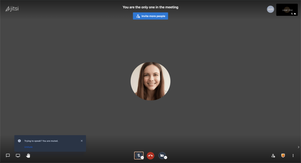
While popular among tech enthusiasts, its complex interface left many hesitant to engage with its features.
The problem
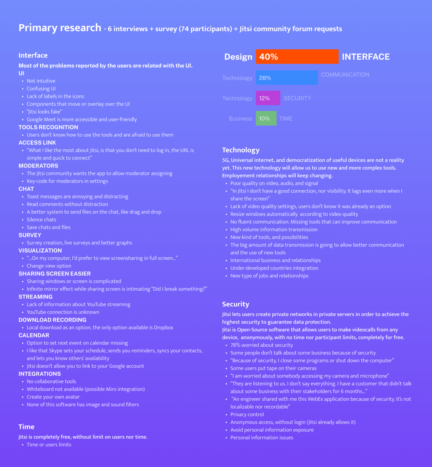
While Jitsi effectively addresses privacy and performance needs and offers a wealth of advanced features, its lack of a user-friendly interface poses a significant barrier for standard users. A key finding: 40% of user pain points are due to a complex user interface for non-technical users, who fear of “breaking something” by mistake.
The solution
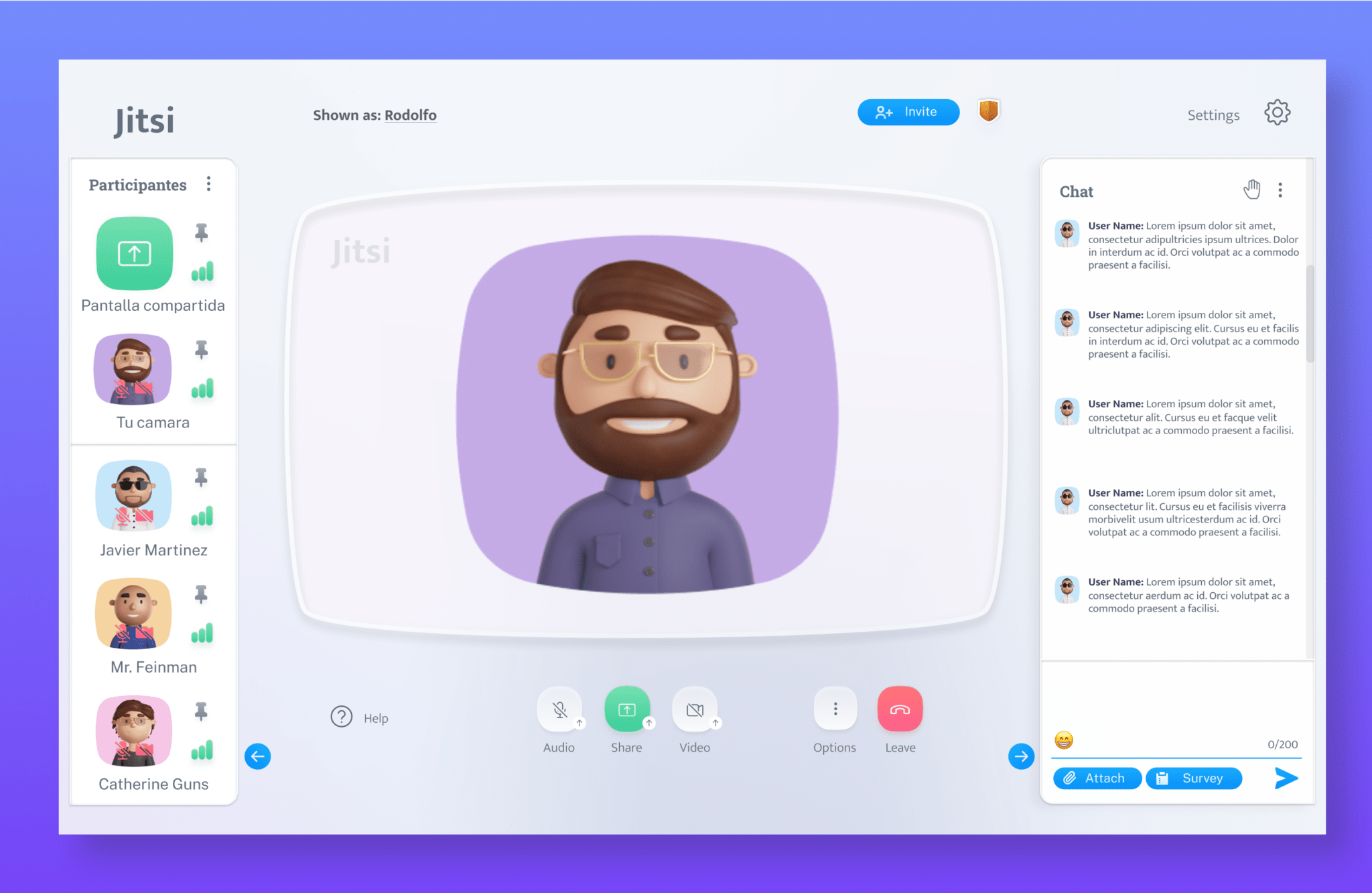
The solution involved designing a brand new user-friendly interface tailored to meet the needs of elderly users, with the premise that “if it works for the elderly, it´ll work for everyone.” To simplify interactions and foster user confidence, the redesign adopted familiar and tangibledesigns such as those found on classic tube TVs.
Video Summary
I take insights from real users and turn them into simple, smooth experiences. The challenge? Making a powerful video platform easier for people who aren’t tech experts. With inclusive design, smart decisions based on research, and a clear, simple interface, I help more people feel confident using technology. 🧓 Friendly and inclusive design 🎯 Decisions based on real user research 🧩 Simple design for a complex product
Jitsi started as a student project back in 2003 — and it’s grown into one of the top open-source video tools today, with a sharp,engineering vibe and a sleek digital aesthetic. It’s known for:
🛡️ Strong security ⚙️ Powerful features 💻 Total control with private setup
Research
We kicked things off with deep user research — diving into behaviors, frustrations, and what really mattered. That gave us clarity to shape the value prop and and refining the experience around what drives real impact.
🧠 Insight-driven 🎯 Value-first ✨ Designed for people
Insights
Even with powerful features, 40% of user issues came down to one thing: a confusing interface. For many — especially older adults — the fear of getting lost or “breaking something” made the platform hard to use.
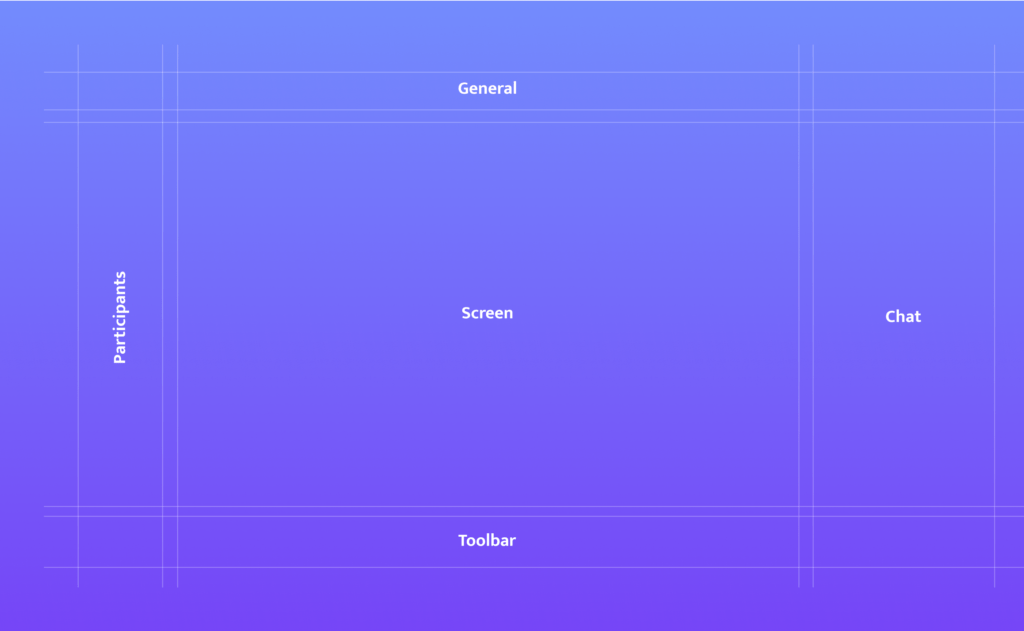
We designed with flow in mind — standardizing layouts to keep transitions predictable and intuitive. This helped reduce disorientation and created a smoother navigation experience for every user.
🔄 Predictable patterns 🧠 Cognitive ease 🚶♂️ Effortless movement
Aesthetic
Inspired by analog interfaces, we built a visual language using tube shapes and soft geometry to bridge the gap between users and tech — improving perception, flow, and emotional comfort.
📻 Analog inspiration 💡 Tactile clarity 💬 Visual empathy
Movement & A11y
To reduce friction and increase task completion, we introduced staggered transitions to create a more natural rhythm — making interactions easier to follow and more digestible.
🧠 Cognitive ease 👁️ Visual clarity 📈 Better user control
Testing
Usability testing revealed a clear shift: users moved from uncertainty to confidence. What changed? Users felt more in control, more comfortable, and more willing to engage. The feedback says it all:
🗣️ “Clear and straightforward.” ⚡ “Fast and user-friendly.” 🎯 “Simple, but smart.”
Conclusion
Through deep research and iteration, this redesign addressed usability gaps that previously limited access to Jitsi’s full potential. We delivered a streamlined, inclusive experience—validatedby Hi-Fi testing anduserfeedback.
What started as a usability challenge became a strategic shift: from complex to clear, from intimidating to intuitive. This project highlighted the value of accessible design in driving adoption and user satisfaction.
It’s a strong example of how UX/UI decisions can shape realoutcomes—for real users.
Did you find this case interesting? I recommend reading the one about Meerkapp to see how we were able to create value without requiring the user to open the app.