In this post, we are going to see the first user research sketches ? according to the research results, the user personas, the empathy map, and the value proposition canvas but especially on the conclusions reached.
The most important in research is the conclusion that a professional arrives and what to do with it.
Trying to understand the user’s needs, the situations, and the context, we present the first sketches of how could be the solution to their need to show them and start an iterative process, so let’s go. ??♂️
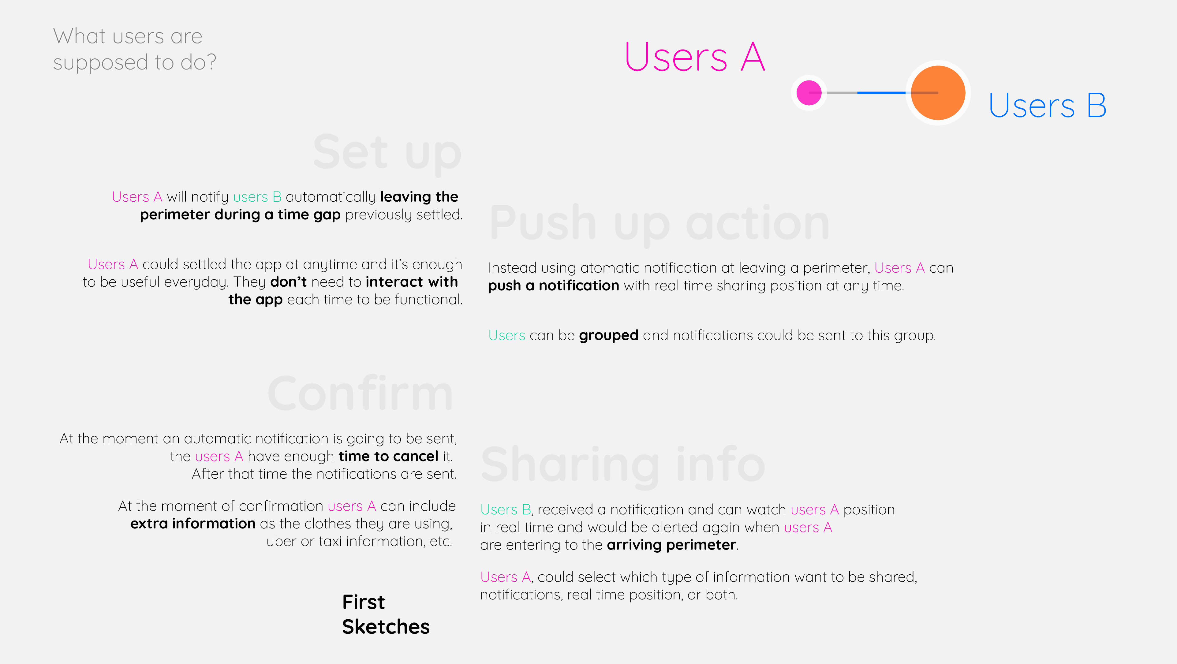
In this very first part of the design process we are going to pay attention to 4 screens:
- [User settings] User set start point, time gap, and actions.
- [Manual notification] Users can play actions manually.
- [Action confirmation] Before playing actions the user must confirm it.
- [Sharing screen] The user that receives the actions enter the sharing screen mode.

It’s a fact that the users use less than 5 apps everyday.
It’s also a fact that the youngest sometimes forget to call their parents.
So, one of the most important screens for this tool could be the one where the user configures the actions, because once it’s set, it could be functional despite user interaction, I mean no user interactions needed.
What kind of actions the user will need to set?
- Set a starting position. ?
- Set an initial perimeter. ?
- Set actions to release: notify starting, share position, notify arriving. ?
- Set arriving perimeter. ?
- Set arriving point. ?
- Users to notify and share positions. ?
But what about whether the user prefers to develop actions manually? So, it could be another interesting screen.
If the user wants to push a manual action it could be made directly from the Home screen.
It shows the user current position. If the user doesn’t set a starting perimeter the info could start sharing info at the moment.
Also could show users and groups, to easily turn on/off the sharing info.
It must have an option to set a new destiny.
This screen could be the same when a user is sharing a position or info to others.


A confirmation pop up message is necessary to ? avoid accidental notifications by the users.
We can take advantage of this step to include a message ✉️ or have control of the actions ? that will be developed before activation. For many users, privacy is important and would appreciate having more control over it.
In this case, we proposed two different screens, one for automatically presenting actions making emphasis on the cancel button, and another one for manual notifications.
In the first case, they automatically run, the user has a timer to cancel the action or automatically run.
Maybe there are not necessarily two screens, in this case, maybe just one but with the timer for automatic cases is fine. ??
Finally, the sharing info screen mode is necessary for the user that received notifications and must show in the map the position of the user that is coming and the perimeter where the arriving notification is launched.
Also could show an estimated time to arrive if the app is integrated with Google Maps or Waze and if the user is using them but as according to with the research, the user has a routine and they will make practically the same way every day so:
- Users that share info are not going to use an app such as Gmaps or Waze because they already know the ? best way to use it.
- Users that received information will develop a time approach ⏱ of how much time the other user could delay in arriving because of the routine. Also could have an idea of that time seeing the position on the map or the distance.

Conclusion
Now that we have our first UX sketches we could start to iterate them in order to achieve a better experience for the users.
In the beginning, we could criticize our first approaches and maybe show them to somebody and make some changes using design principles and achieve something more interesting to show to users before starting to recruit more information.
Also, it would be interesting to know what kind of extra information could be displayed or what other commands could be necessary.

For example here is re-sketched the setting screen taking in consideration:
- Information and commands priority.
- Order of the lecture.
- Groups of information.
- Data entry.
In this case, it is not shown the estimated time since the user started the journey. It could be set by the user, taking into consideration that the user is not going to use another app as Gmaps or Waze to indicate the way and the time.
If you didn’t read the research results to understand the reasons for the decisions taken here, you can read it in this ?? link.